Olive
The Design Process of a Holistic Health Application
Project Overview
The need for Olive came from a friend named Rue who was diagnosed with chronic migraines and debilitating stress and anxiety.
Rue needed a better way to manage her health in a way that took into account her whole body including her mental and physical well-being.
Olive was born to help people bridge the gap between their physical and mental health to achieve an improved quality of life.
Role
UX / UI design, research, and testing of the Olive app from conception to delivery
Competitive Analysis
User Research & Interviews
Persona Creation
Defining User Flows
Information Architecture
Paper & Digital Wire Frames
Low - High Fidelity Prototypes
Conducting Usability Studies
Iterating On Design
Responsibilities
Duration
6 months
Tools
Figma
Figjam
Miro
Excel
Pen & paper
The Problem
Users require a dependable resource to effectively manage their health, establish lasting habits, and find reliable holistic health information.
User Research
Three participants were selected based on their interests and motivation in physical / mental health
Responses were analyzed utilizing affinity mapping to categorize and group findings
User Interviews
User Frustrations
Difficulty setting new health habits
Finding reliable health information
Lack of access to holistic health information / products
Accessible research-backed holistic health information
Ways to use schedules and reminders to keep up with health habits and routines
Ways to track health symptoms & outcomes in order to see what really works for the user
User Needs
User Personas
Developed from research findings in order to keep the wants and needs of users like Rue front of mind throughout the design process.
User Stories - Flows - Wireframes
User Stories were created to layout essential tasks users like Rue would want and need to complete with the application
These stories were then further broken down into user flows to outline the exact steps a user would take to complete each task
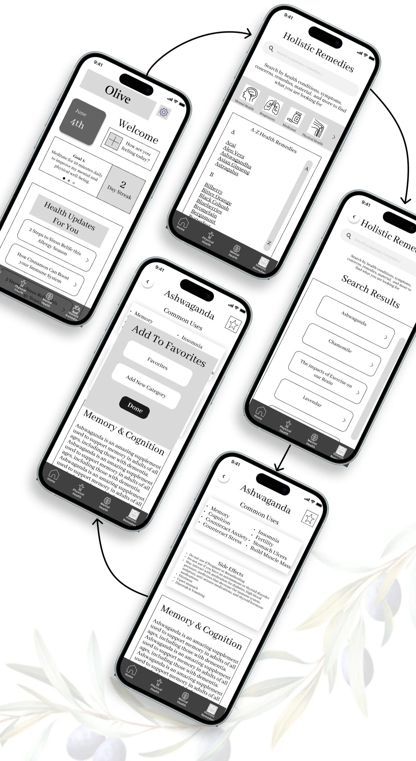
Once the flows were finalized, they were used to develop the initial low-fidelity and mid-fidelity wireframes for each task for our initial screen layout
As someone with frequent back pain, I want to be able to track my pain levels vs. what I am using so I can see what helps my pain the most.
User Story
User Flow
Wireframes
As someone who wants to support my health naturally, I want to find holistic remedies specifically for my chronic back pain, so that I can avoid taking pharmaceutical medications.
User Story
User Flow
Wireframes
Usability Testing
Study Type: Moderated In-Person
Version Tested: Mobile
Program Used: Figma
Equipment: Personal Mobile Device, Video & Audio Recording
Participant Number: 6
Study Type & Participants
Evaluate the overall usability of the Olive App
Log-in
Sign-up
Completion of specific tasks
Assess the efficiency of the navigation structure & ability for users to find and interact with features
sign-up/in
onboarding
creation of health goals
tracking of health symptoms
Finding & saving holistic remedies
Goals of Testing
Affinity Mapping
Rainbow Spreadsheet
Problems & Solutions Identified
Design Language
Next Steps
Conduct Another Round of High-Fidelity Usability Testing
Another round of usability testing would be required in order to identify further areas of improvement and user research-backed evidence to fine tune the design.
In the next round of testing, I would focus specifically on key features including the goal setting feature, calendar feature, and mindfulness features in order to optimize these experiences for the users.
Build a Community Feature for Health & Well-Being
A feature that would allow users to connect with one another, share health questions / answers, and improve mental health among all members.
Hand - Off to Production
Prepare a good hand-off for the production team to help expedite the development process.
Lessons Learned
I learned the importance of balance when it comes to project requirements and the needs of the users throughout the design process.
I found the best way to maintain balance between the two included iterating designs quickly in order to complete frequent user testing throughout the process.


