

Total Management Solutions
Website Redesign
Design Objectives
Total Management Solutions (TMS) supports companies in optimizing employee benefits using Sub-Pay Plans. However, challenges arise with the current website's complexity and inconsistent layout across devices, hindering effective communication of TMS's value.
The objective is to redesign the TMS website to offer potential business associates a clearer insight into TMS services and the value they bring to their corporations.
Reasons for Redesign
In redesigning TMS's website, key factors driving the need for change include:
Inconsistent Navigation Across Devices:
Users struggle to navigate the site seamlessly across different devices, leading to frustration and difficulty in accessing essential information.
This inconsistency hampers user experience and detracts from the website's effectiveness.

Complex Content and Poor Layout:
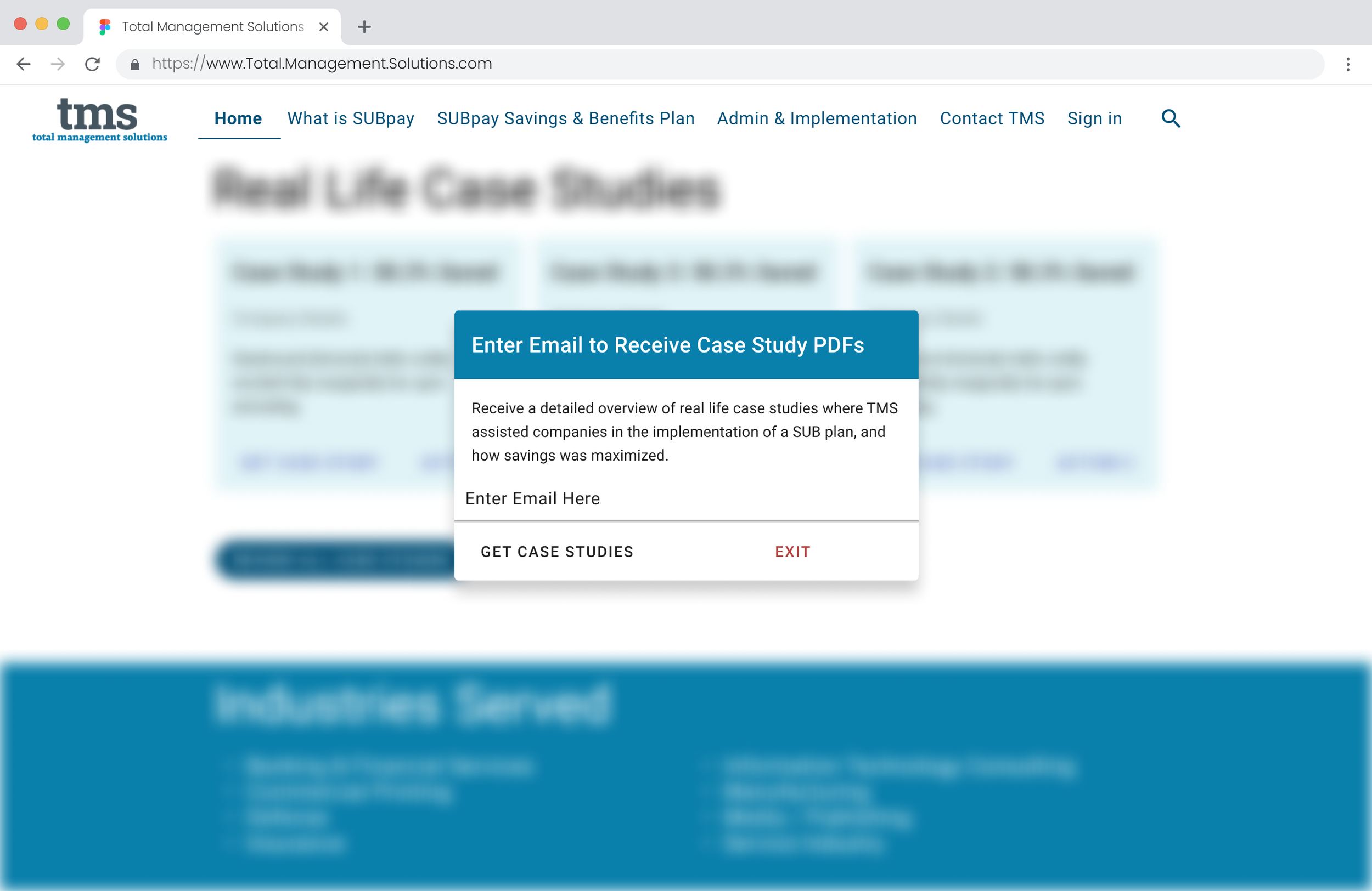
The current site's content is mixed with legal jargon making it difficult for users to understand it easily.
Ineffective layouts obscure TMS's value proposition, impeding its ability to attract potential clients and foster business growth.

Lack of Clear Home / Landing Page:
Without a designated central point, users find it difficult to orient themselves and return to a starting point, exacerbating navigation challenges.
Accessibility Concerns:
Issues with typography, color contrast, and content readability create barriers for users with diverse needs, undermining inclusivity and hindering understanding of TMS's services.


Addressing these factors is crucial for enhancing user experience, effectively showcasing TMS's services, and supporting business objectives.
Goals & Solutions
Streamline site navigation:
Implement a responsive navigation bar for consistency across devices and platforms.
Ensure the Navigation bar adjusts to screen size and consistently displays the same navigation items.
Enhance content layout & design:
Restructure the site's information architecture into streamlined categories.
Rewrite content for improved scannability, readability, and understanding of concepts.
Improve site infrastructure:
Add a clear home page directing users to complete different tasks.
Provide a summary of TMS’s services and experience on the home page.
Increase interactivity:
Introduce features such as a savings estimate calculator.
Offer users a "curated" experience, allowing them to select items for further exploration from the home page.
Enhance accessibility:
Establish consistent visual hierarchy.
Implement an improved color palette with enhanced color contrast.
Ensure consistent typography style throughout the site.


Users & Audience
Prospective business partners seeking collaboration with TMS
Existing business associates seeking account access with TMS
Roles & Responsibilities
My Role: UX/UI Designer
User stories, wire-frames, sitemap, visual design, mock-ups, prototyping, collaboration with developer and stakeholders.
Tools
Duration
Figma
Figjam
Pen & paper
3 months

User Stories
To initiate the design process, user stories were formulated to identify the primary tasks users require to complete via the website.
Sitemap
Building upon these stories, a sitemap was crafted to restructure the existing information architecture, enhancing the overall layout and organization of information.

Low-Fidelity Wireframes
Using the sitemap as a reference, quick paper wireframes were developed to outline the screens necessary for users to achieve their goals, allowing for easy iteration and adaptation.


Mid-Fidelity Wireframes
Following the establishment of the website's primary structure, mid-fidelity wireframes were created and presented to the developer who ensured the designs were structurally feasible for completion.

High Fidelity Wireframes
A variety of mood boards were created and reviewed with stakeholders in order to guide the visual design process, focusing on typography, color, imagery, and style to elevate wireframes to a high-quality level. Opting for the Angular Material design platform, adherence to Angular design patterns and styles was ensured in collaboration with the developers.


Style Guide
Following the completion of high-fidelity wire-frames, a Visual Style Guide was compiled, detailing design specifications and providing guidelines for the consistent use of UI components across the application.


Before & After
The website now offers seamless viewing and usability on mobile and tablet devices, featuring consistent navigation and enhanced user experience. Adopting a mobile-first approach, the design incorporated three breakpoints to optimize user experience across all devices.
Top Navigation Bar
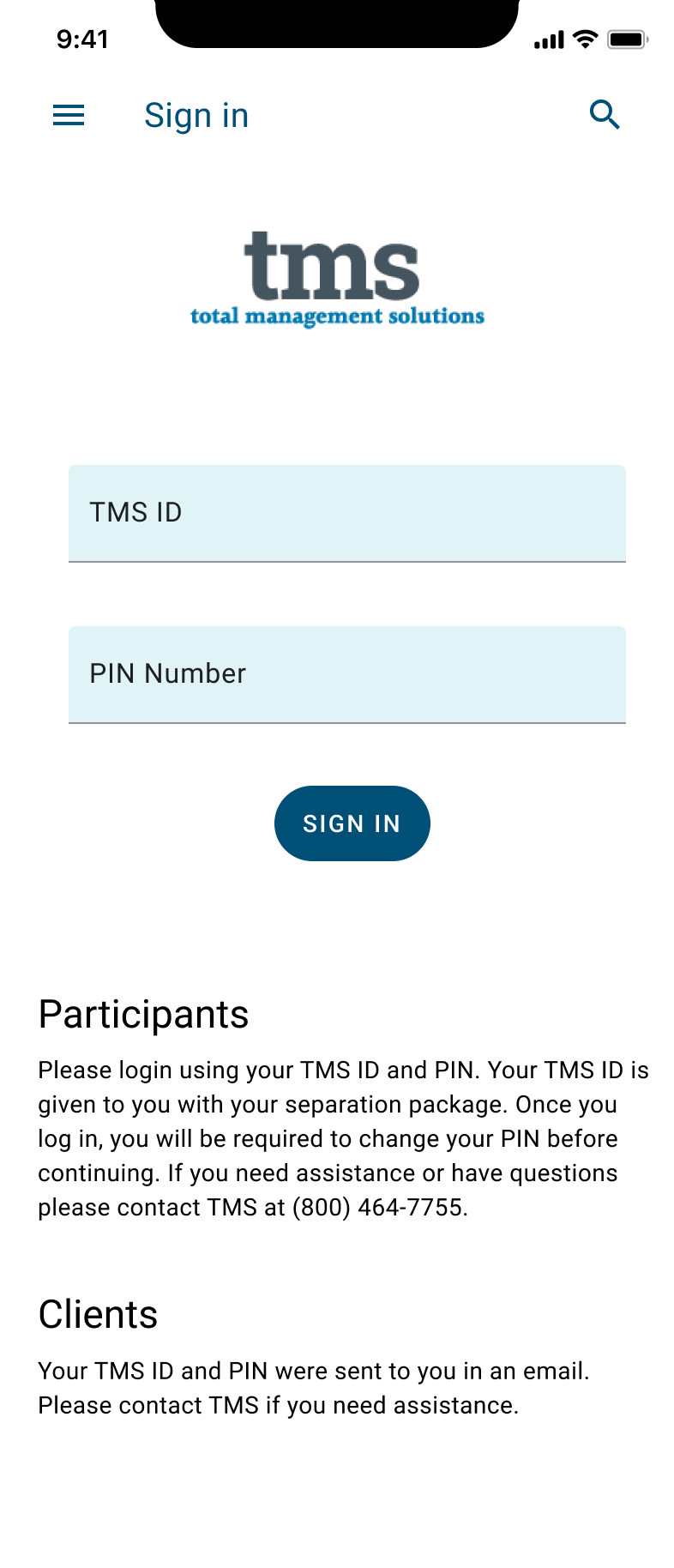
Before
Inconsistent menu options
Missing “The Severance Experts” listed on mobile navigation

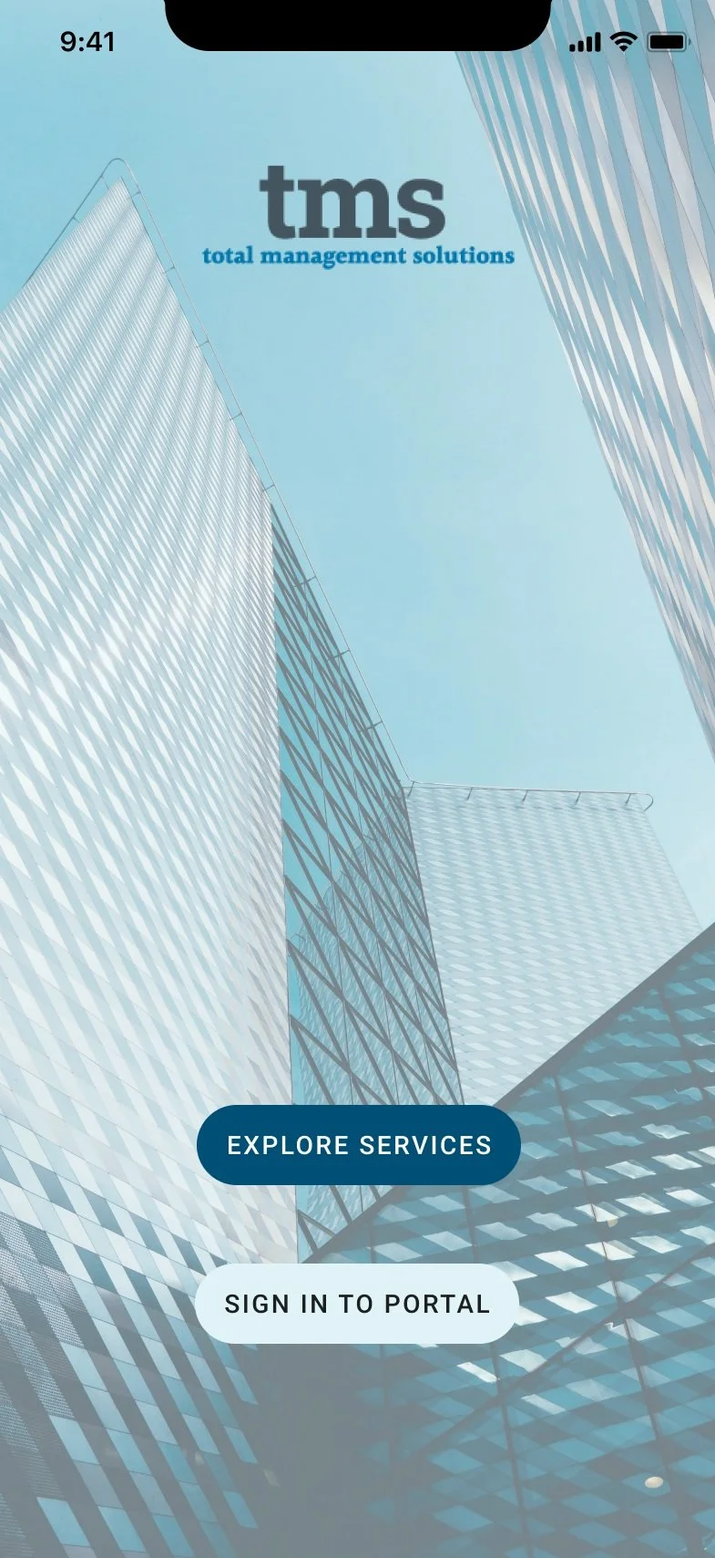
After
Improved information architecture
Consistent menu options throughout all device sizes

Mobile Navigation
Before

Top Navigation covers TMS logo.
Inconsistent menu options, with mobile including “The Severance Experts” on navigation, and desktop does not.
After
Consistent menu options throughout all device sizes
Improved color contrast for increased accessibility
Navigation drawer added to hamburger menu format to improve space availability on mobile.

Website Footer
Before
Inconsistent use of footer across pages
Poor legibility in footer
No call to action
No useful links


After
Improved color contrast & legibility
Call to action with form present for users to contact TMS directly to improve business conversion
Used consistently throughout all pages / screen sizes
Useful links added

Responsive Design
Before
Design was incompatible with mobile devices leading to extensive usability issues
Poor color contrast of body text
Long lines of text makes it difficulty to scan quickly


After
Grid / column layout adjusts based on device size for optimal user experience
Cards implemented to organize content
Clear call to actions put throughout site.


Final Mockups


Next Steps
Hand off the design to the developer for implementation.
Conduct usability testing across all breakpoints to identify and address any usability issues or pain points with the new design.
Challenges
In the initial stages of the project, I faced the challenge of establishing an optimal information architecture, primarily due to my unfamiliarity with the client's specialized service called Sub-pay plans.
To tackle this obstacle head-on, I dedicated myself to extensive research, delving deep into understanding the concept while also examining how competitors structured comparable content.
Furthermore, I actively sought insights from company representatives through focused discussions, asking targeted questions to gain a thorough understanding of their business model and goals.
This collaborative approach allowed me to bridge the gap in my knowledge and develop a robust foundation for designing an effective UX solution.
Lessons Learned
Reflecting on the project, it became evident that effective communication with both the development team and stakeholders from the beginning played a vital role.
This contributed significantly to streamlining the design process and maintaining alignment throughout.
